Register now, make more friends, enjoy more functions, and let you play in the community easily.
You need Sign in Can be downloaded or viewed without an account?Register Now 
x
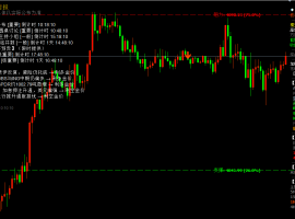
A major advantage of candlestick charts is that they are composed of information similar to bar charts (i.e. opening, high, low, closing data), and all Western cartography techniques can be integrated to enhance candlestick chart signals.
Until the Japanese established candlestick chart technology, its use as a signal analysis method was sufficiently effective. But many analysts today believe that the best results come from combining Western drawing and technical analysis methods. As explained in the previous section, we suggest considering at least the lateral support line and resistance line together. But you may also incorporate technical indicators into your charts, such as vertical bar charts and some moving averages, for further confirmation.
There are certainly many Western tools and candlestick charts that traders can use. We suggest that you continue to use your preferred indicators and use candle charts to use, confirm, or filter indicator signals.
For example, if in theMACDThere is a bearish periodic divergence in the indicators, indicating a new high in prices, but not in the vertical bar chart. A bearish shooting star and a dark cloud cover appear on the chart, which increases the possibility of market reversal.
As seen in the above example, the candle chart shows the twisting signal after the lagging indicator. Despite being bearishMACDThe closing of the swallowing pattern of crossing and bearish is at the same price level, and the technical indicators triggered a signal nine hours later.
There is another way to use the signal provided by the candlestick chart: to exit the position. Imagine you are in an open transaction when a reversal signal or a cross star appears. You may need to reduce the trading range or completely withdraw from a market reversal that is opposite to your initial position.
Another possible way to increase the candle chart reversal signal is to interpret the vertical bar chart of the overbought and oversold market conditions. The following figure shows the trading situation represented by random indicators. The candlestick chart has two reversal signals at the same resistance level. But in the first candlestick chart, the technical indicators are42%This line, but the second one is located on82%This horizontal line - that is to say, there has been overbought. This is an obvious example where two tools overlap when unifying signals.
The use of Bollinger lines, like candlesticks, is very consistent because they are used to measure when the market reaches extreme price levels. The following chart shows a hammer line for the US dollar index in the main support areas. Also, pay attention to how the hammer chart completely fades out of the lower Bollinger chart, adding more evidence of impending changes in price trends.
However, in order to enter the market, these triple confirmations are still not enough —— What else is quite important? The answer is —— Risk to return ratio. The bearish swallowing pattern may be used as the first object to provide a good ratio.
Using drawing techniques, you may say that a double bottom is forming. But this chart format requires32Break the confirmation line in hours. The bullish candlestick pattern that appeared in the previous support area provided an early entry signal.
Thank you for your continuous support GKFX PrimeSupport and Trust If you would like to learn more detailed information You can contact us through the following methods We will wholeheartedly serve you Telephone:15801181351 QQ: 2220083555 Scan code to add customer service WeChat |


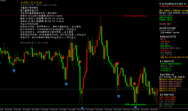
 7month10日午后黄金策略:金价回落至411
目前消息面对黄金还是偏压制。市场对美国利率继续维持高位、甚至进一步收紧的预期有
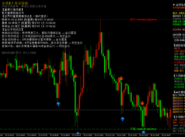
7month10日午后黄金策略:金价回落至411
目前消息面对黄金还是偏压制。市场对美国利率继续维持高位、甚至进一步收紧的预期有
 ZFX山海证券:金价惊险重返4100dollar
7month9日,国际黄金市场上演了一场惊心动魄的逆转大戏。在经历了连续三个交易日的下跌之
ZFX山海证券:金价惊险重返4100dollar
7month9日,国际黄金市场上演了一场惊心动魄的逆转大戏。在经历了连续三个交易日的下跌之
 ZFX山海证券:金价坚守4000Pass!
Wednesday(7month8日)现货黄金价格一度跌至4020美元附近,油价应声暴涨逾5%,刷新逾两周高点
ZFX山海证券:金价坚守4000Pass!
Wednesday(7month8日)现货黄金价格一度跌至4020美元附近,油价应声暴涨逾5%,刷新逾两周高点
 7month9日早上黄金策略:金价深V反弹后
昨晚黄金走了一波急跌,盘中一度逼近4020关口,随后展开深V反弹收复大部分跌幅,最
7month9日早上黄金策略:金价深V反弹后
昨晚黄金走了一波急跌,盘中一度逼近4020关口,随后展开深V反弹收复大部分跌幅,最
 ZFX山海证券:金价被油价大涨压制!
Tuesday(7month7日),油价大幅飙升,现货黄金当日下跌1.42%, receive reports per ounce4105美元,盘中一
ZFX山海证券:金价被油价大涨压制!
Tuesday(7month7日),油价大幅飙升,现货黄金当日下跌1.42%, receive reports per ounce4105美元,盘中一


 Riser card
 Top card
 Silence card
 Color changing card
 lifting jack